
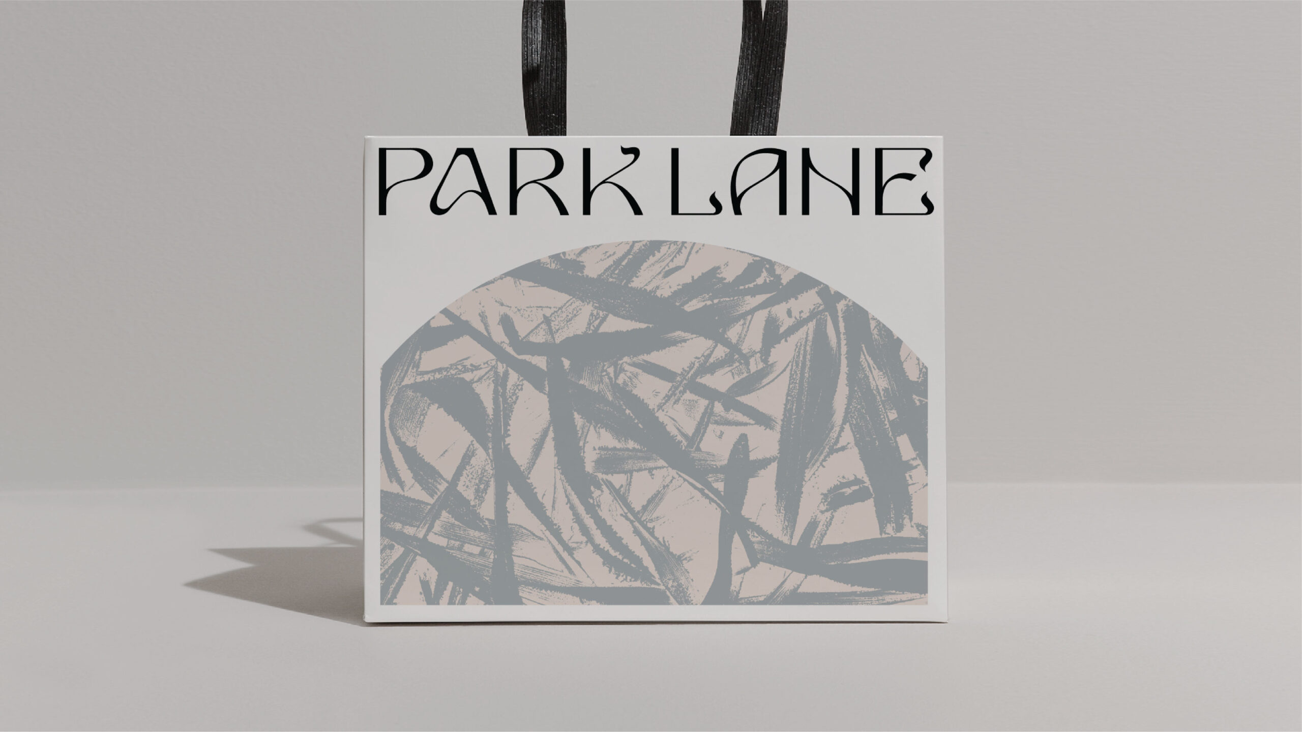
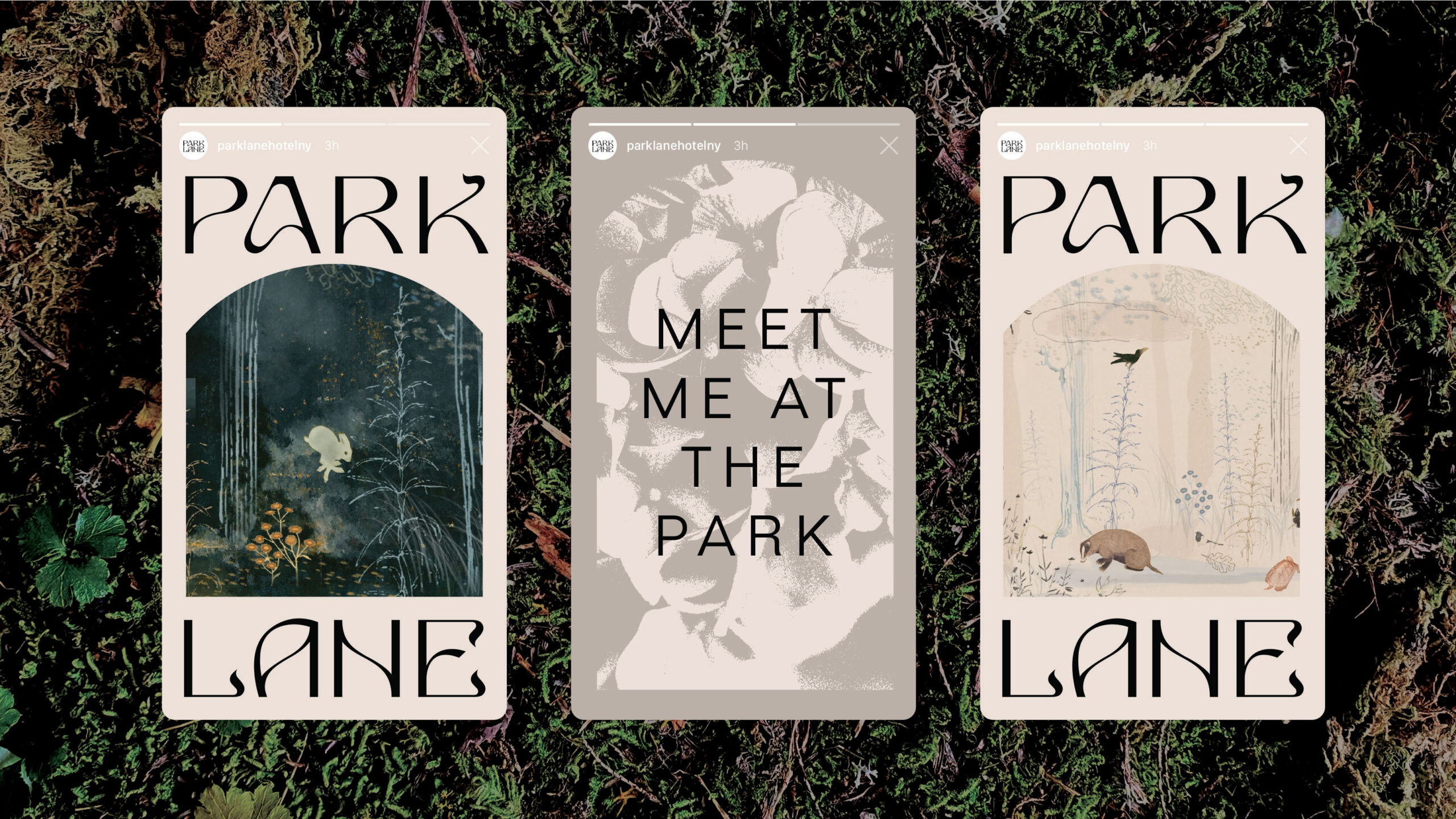
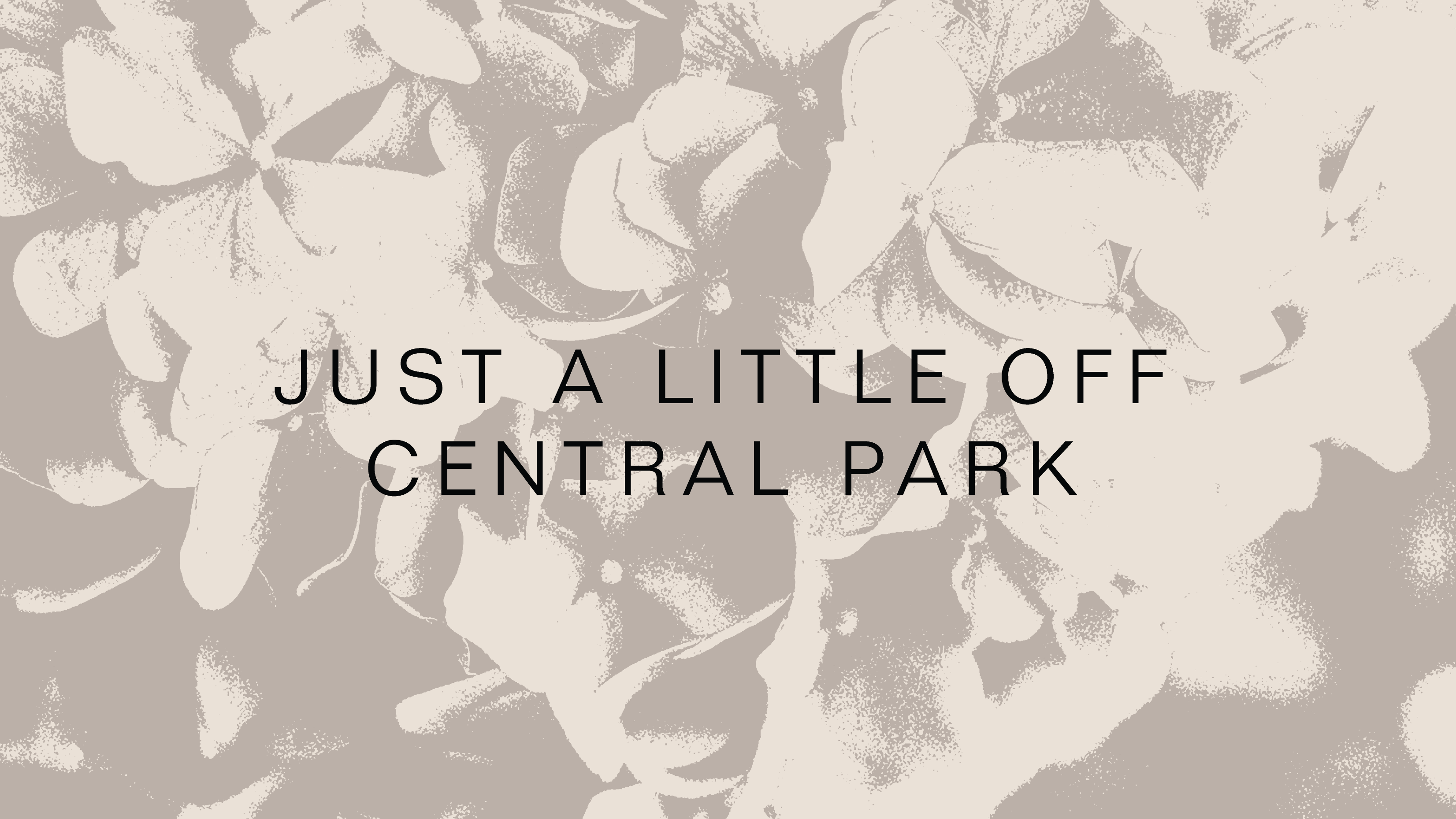
Park Lane
Rebrand
Made at Mother Design
Design Director: Matt Van Leeuwen
Motion Designer: Yaya Xu
Designers: Molly Dauphin, Jorge Badillo, Jerelin Reyes
Bodily
Identity & Packaging
Made at Mother Design
with Jess Yan
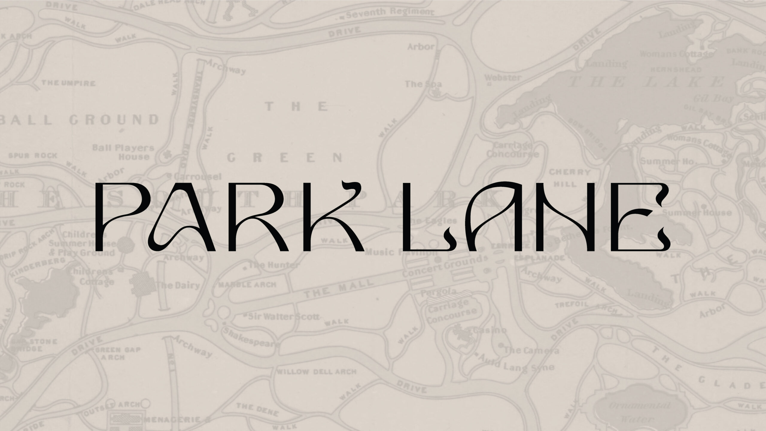
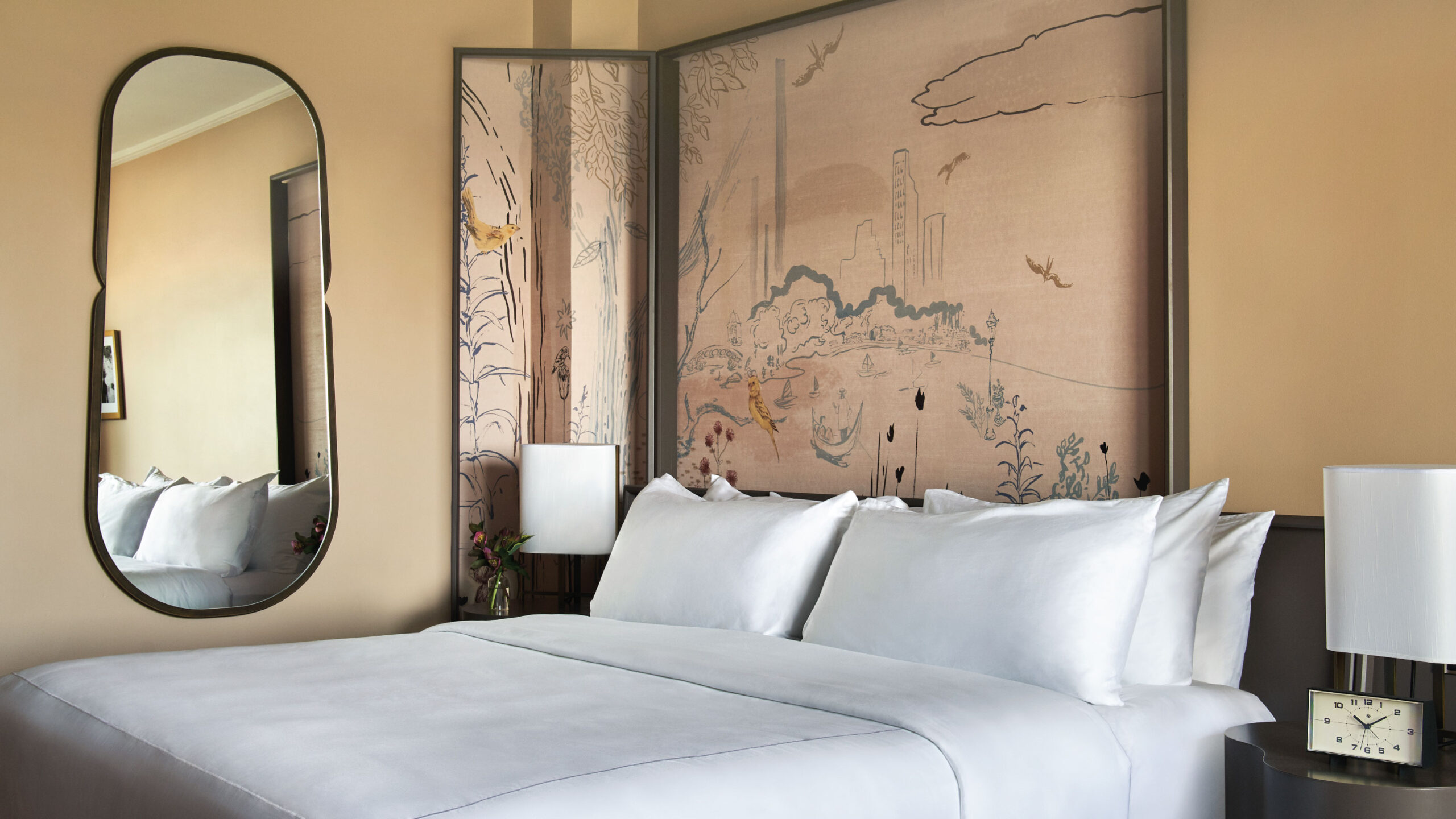
The Park Lane Hotel in New York City stands in brusque, brutal contrast to the luxury hotels of “Billionaire’s Row” that surround it. Constructed in 1971 and situated prominently on Central Park South, it boasts 47 stories of magnificent views and covetable proximity to some of New York’s finest cultural establishments.
Wanting to fit in amongst its neighboring landmark institutions, however, the Park Lane Hotel found itself adrift in a sea of old-world sameness. Traditional luxury—especially that which characterizes the Ritzes, Plazas, and Pierres—feels antiquated and exclusionary, resonating less and less with the modern traveler. With a near-total renovation, Park Lane sought to fully embrace the nonconformity historically advertised by its exterior, and so Mother Design helped position the new brand as such: as an only-of-its-kind, uptown sanctuary to rendezvous with all sorts.
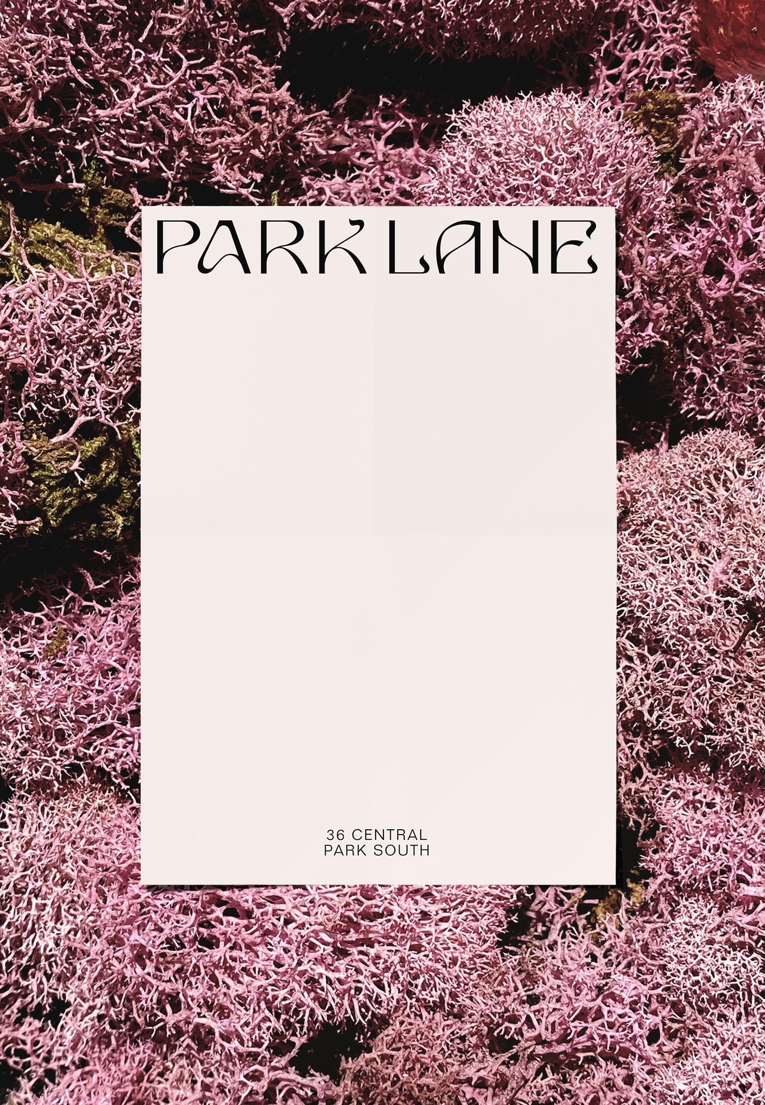
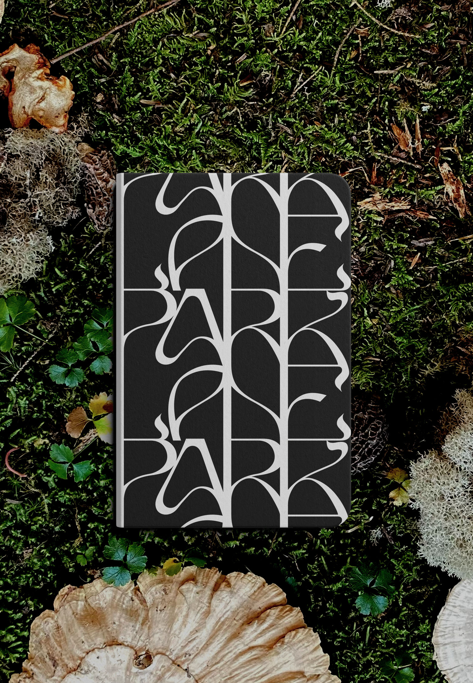
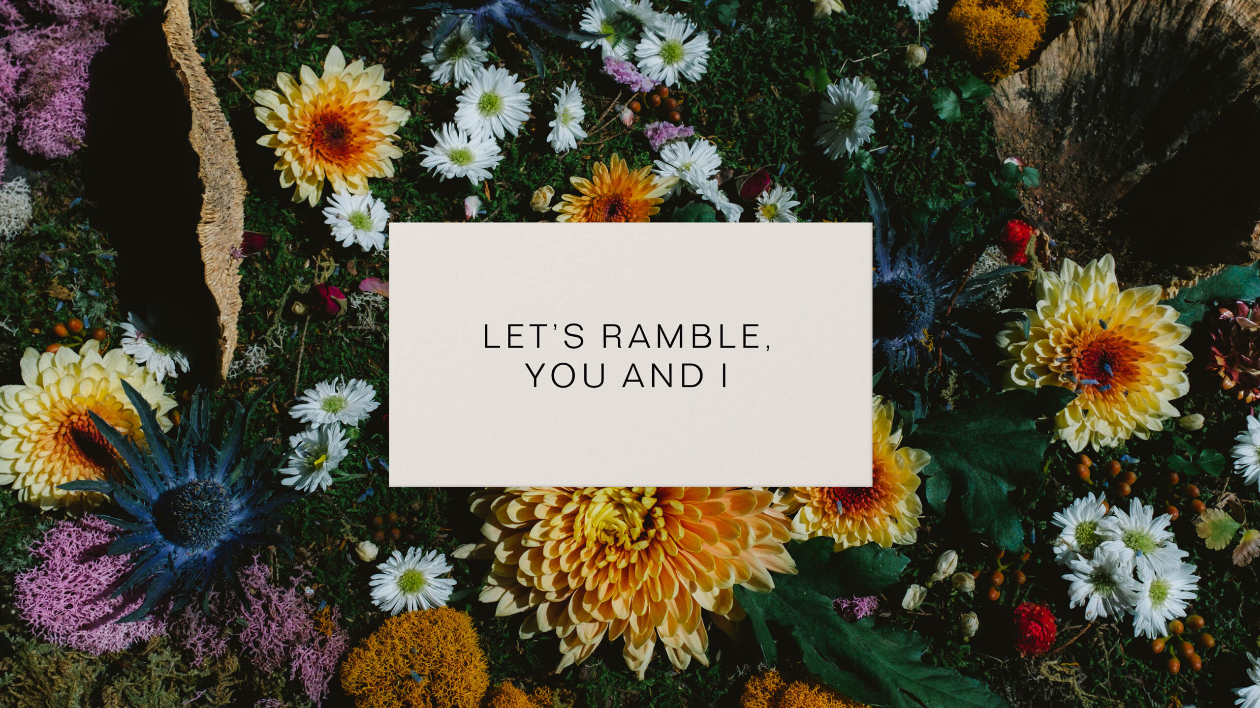
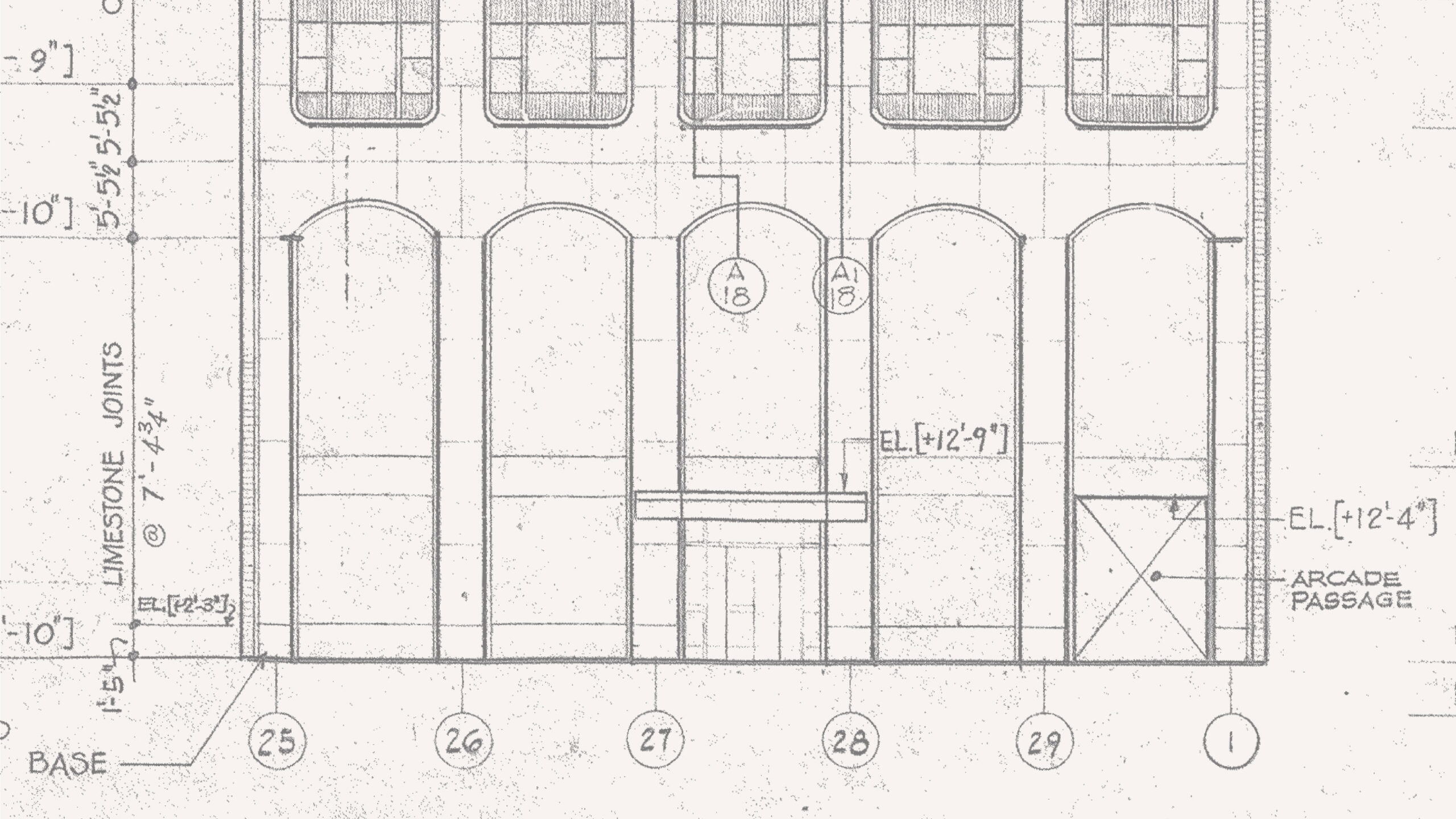
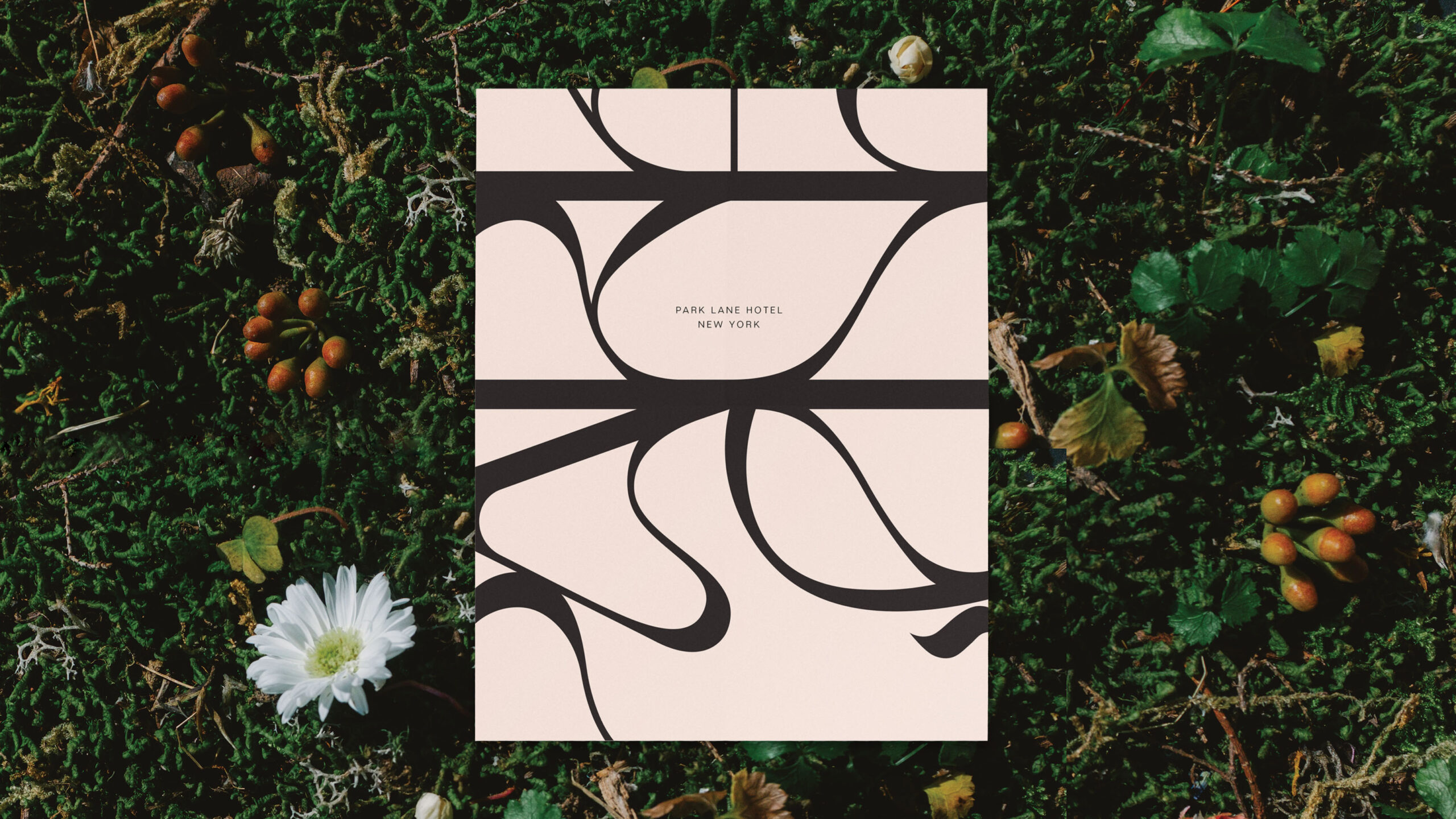
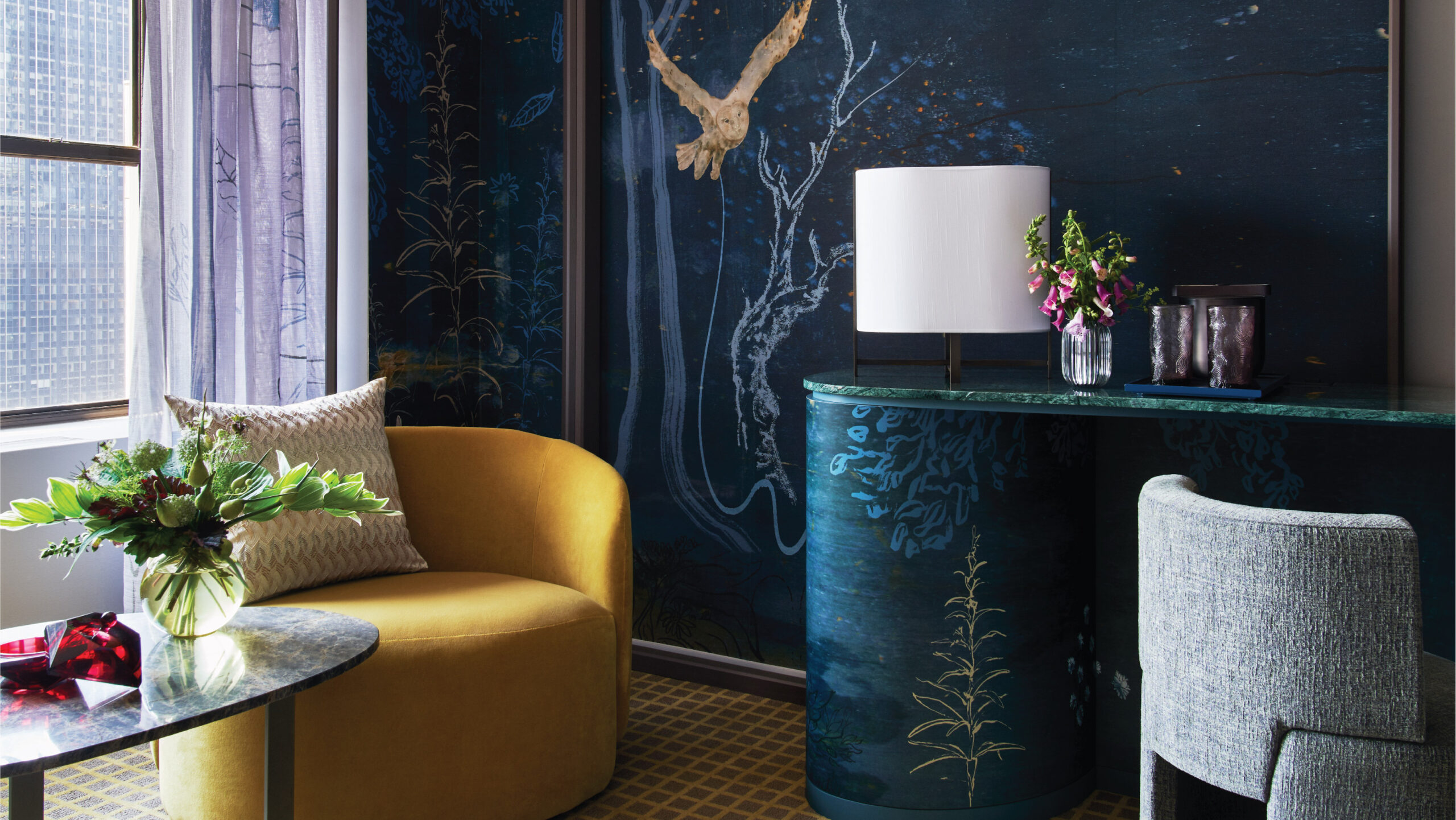
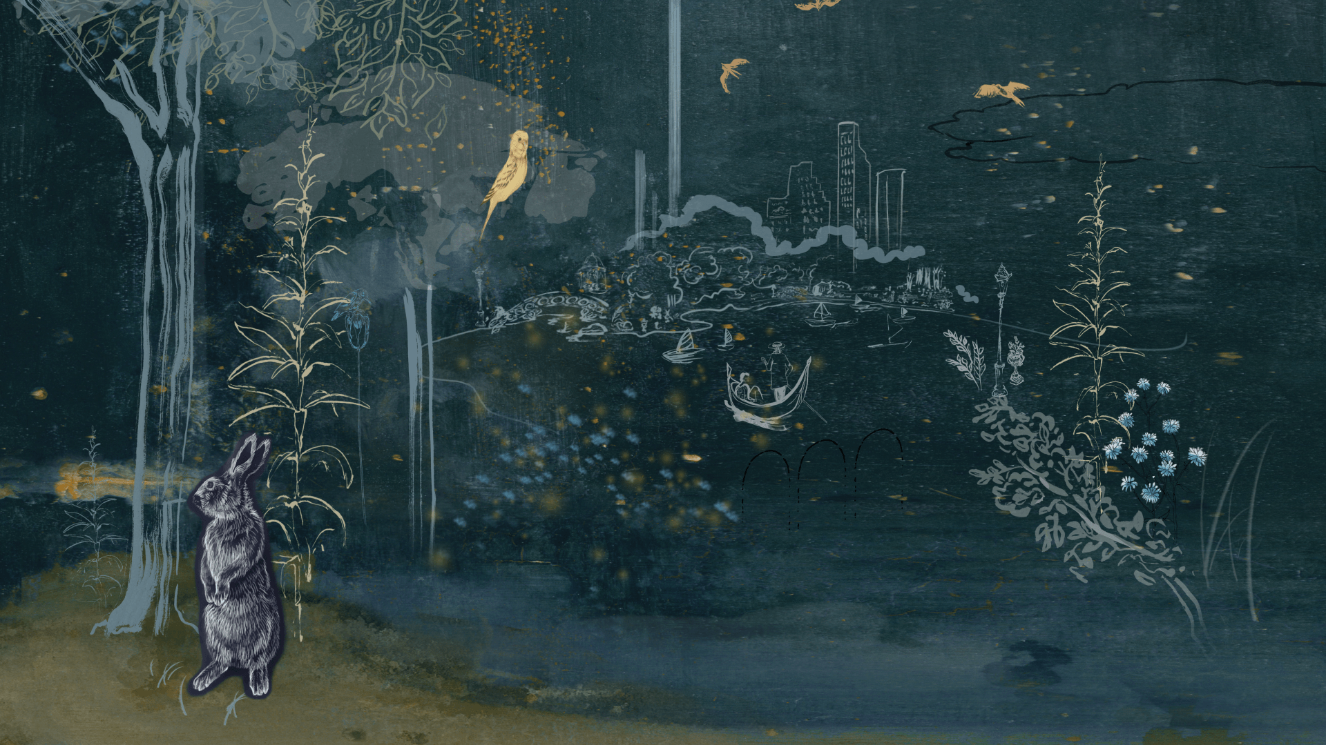
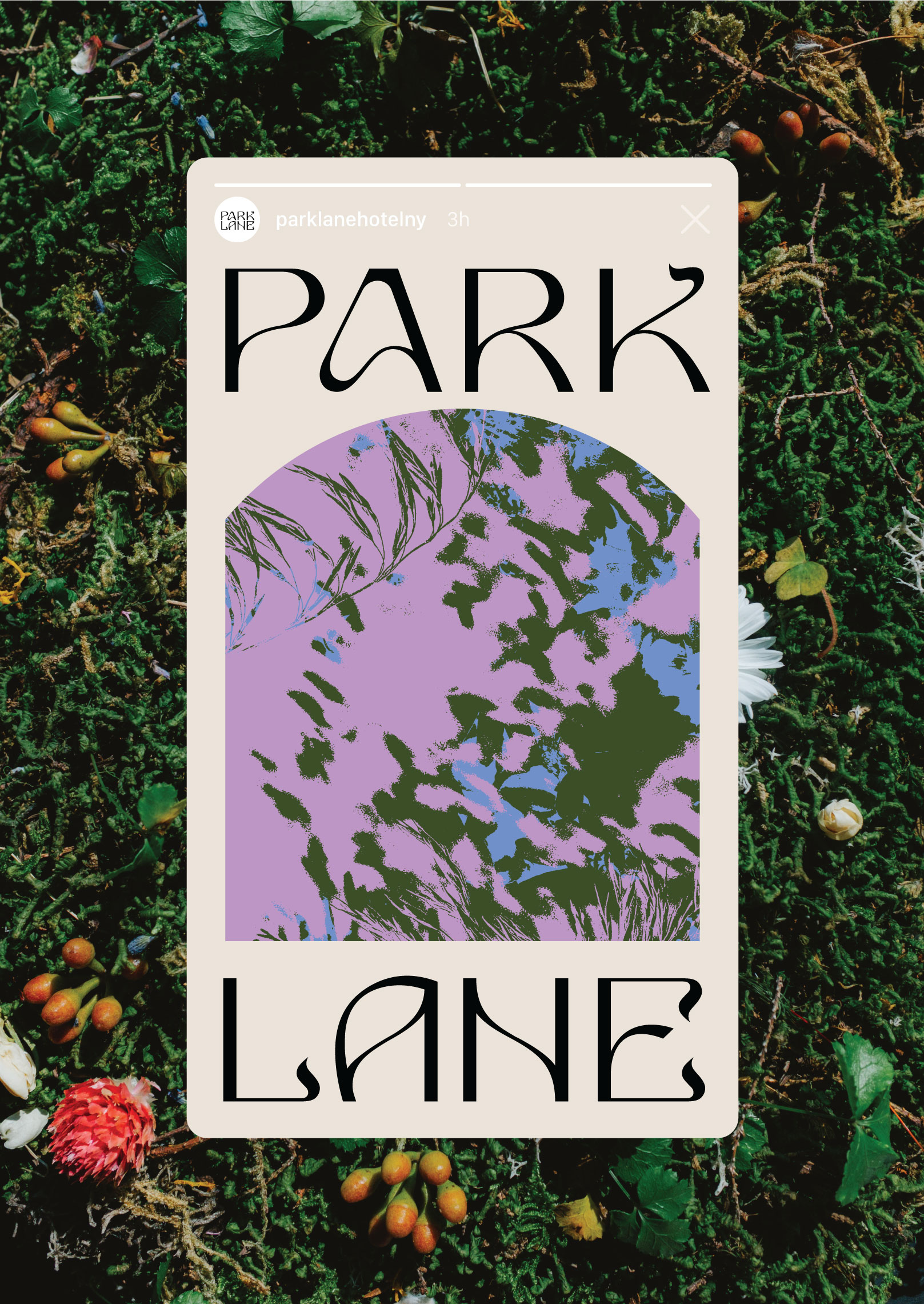
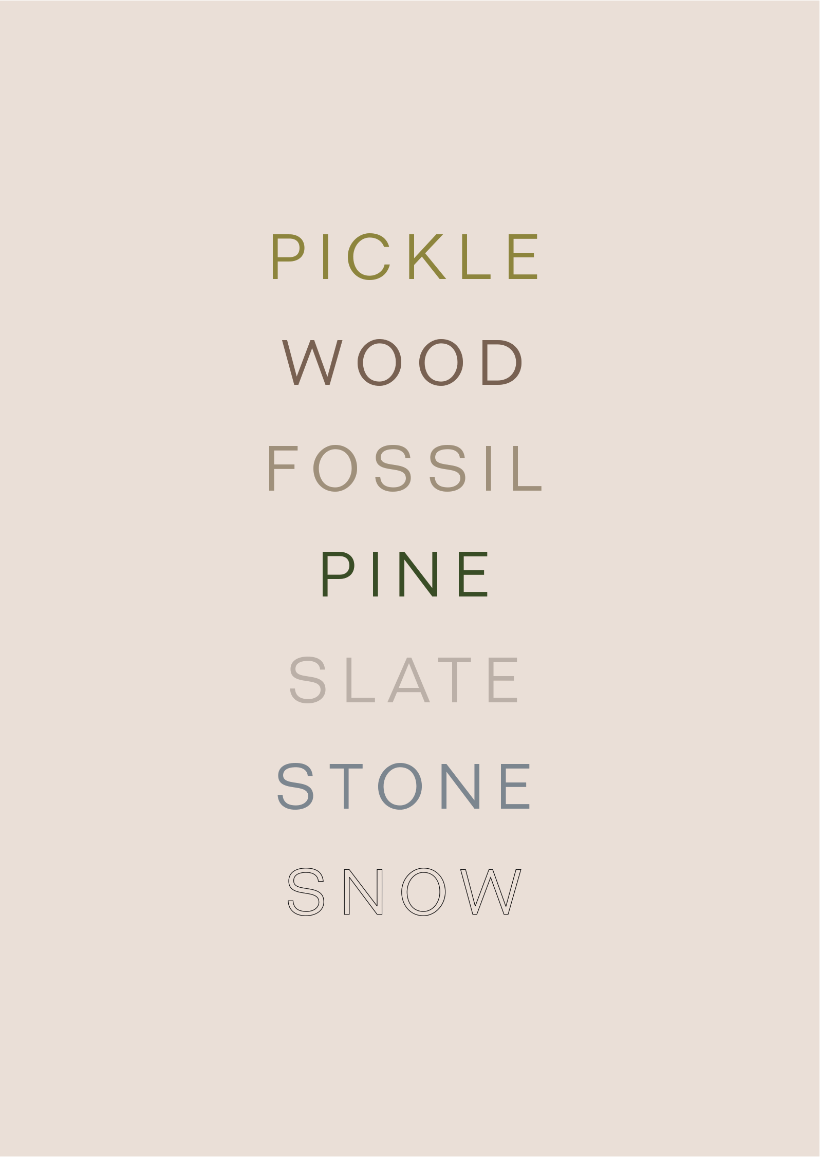
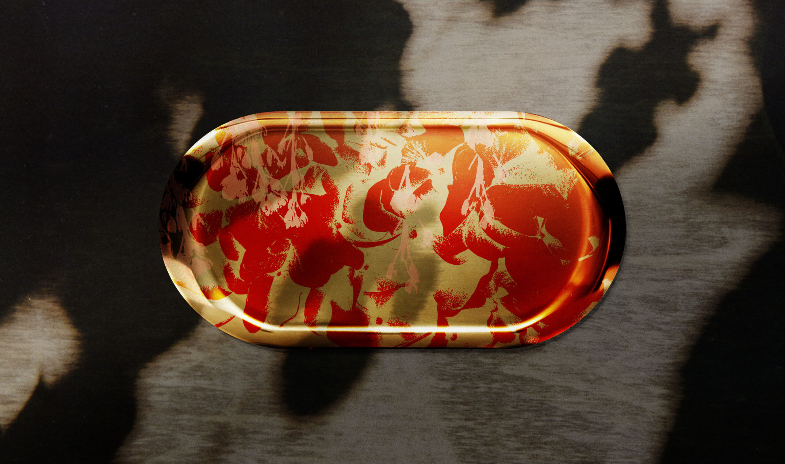
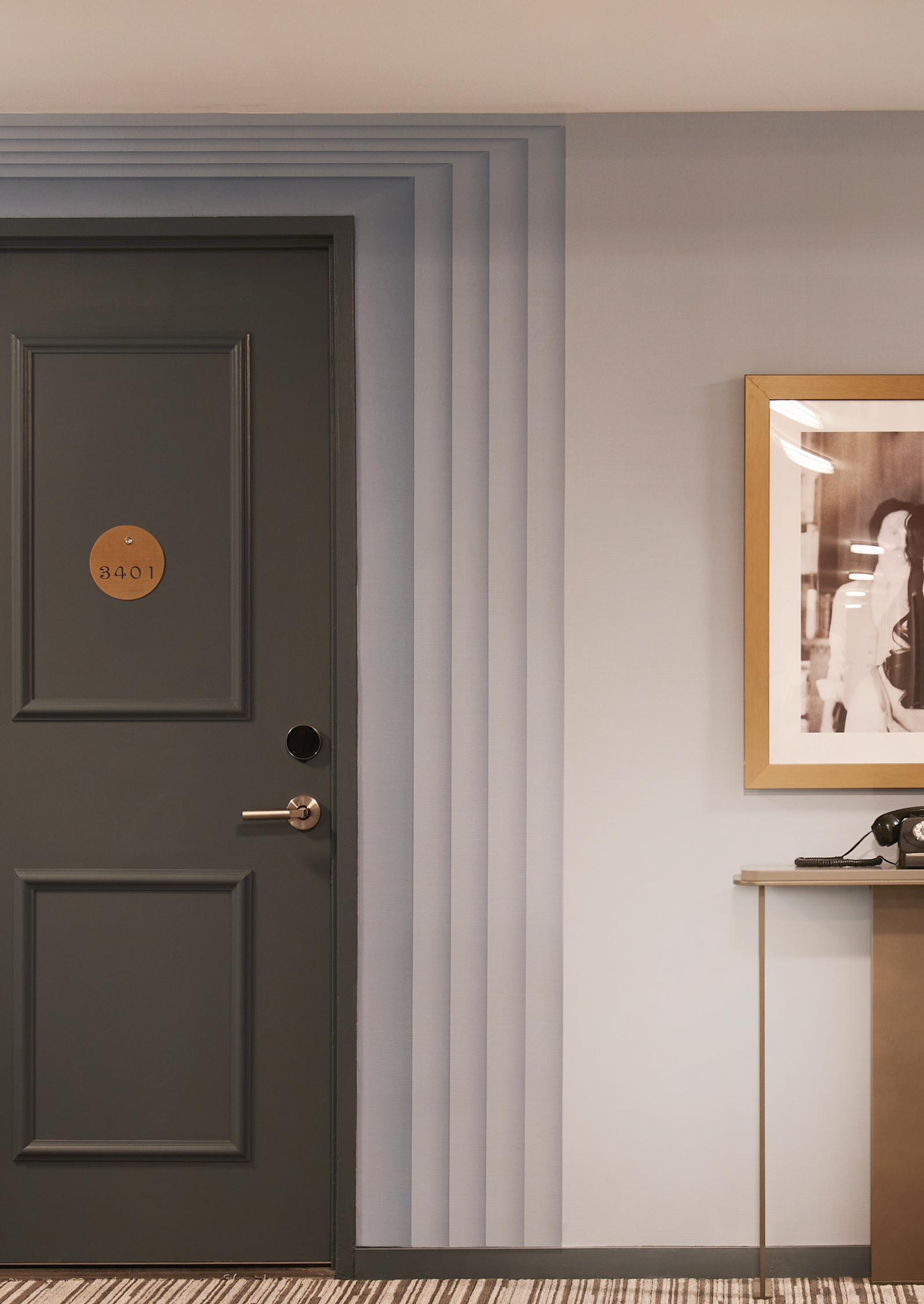
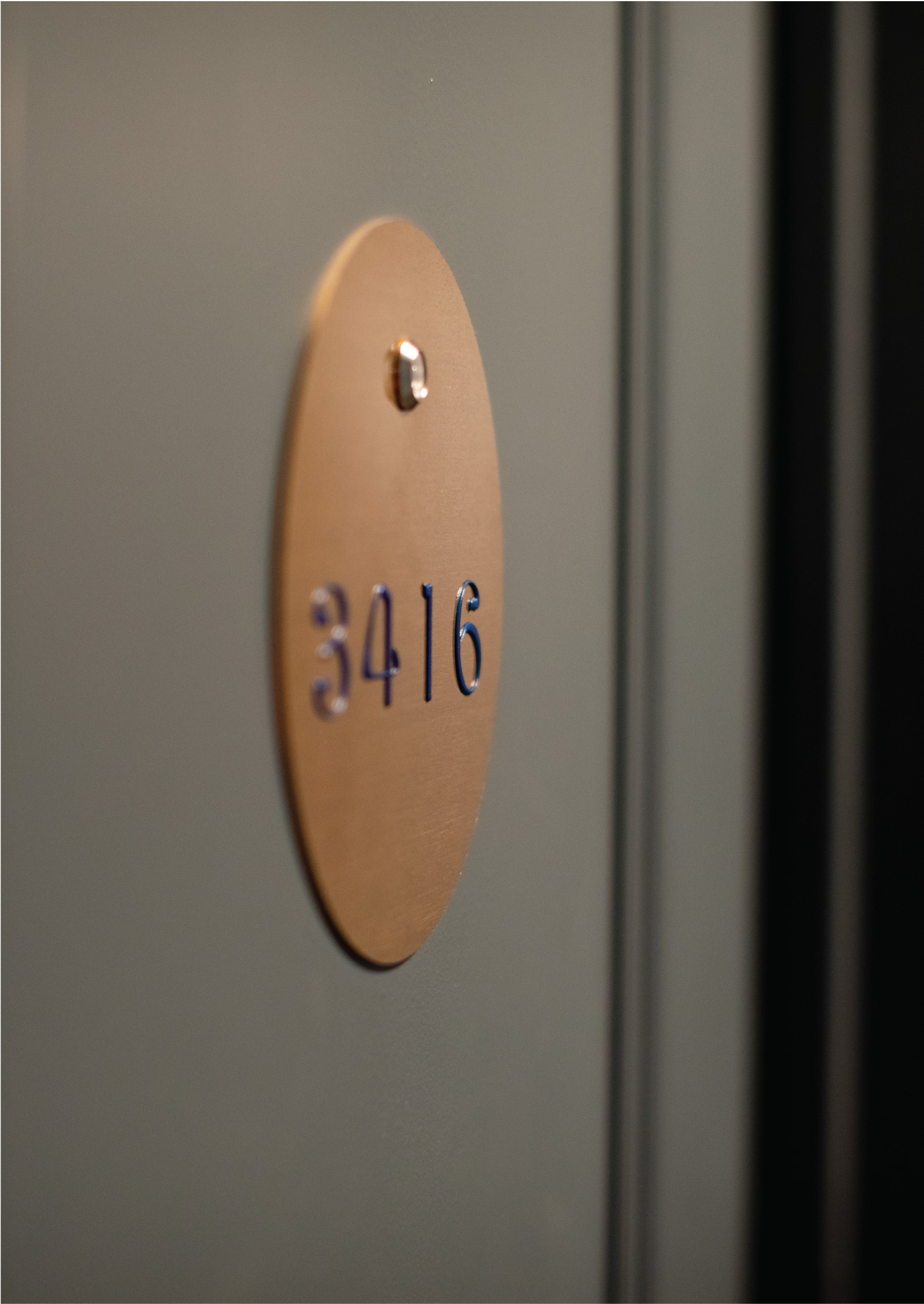
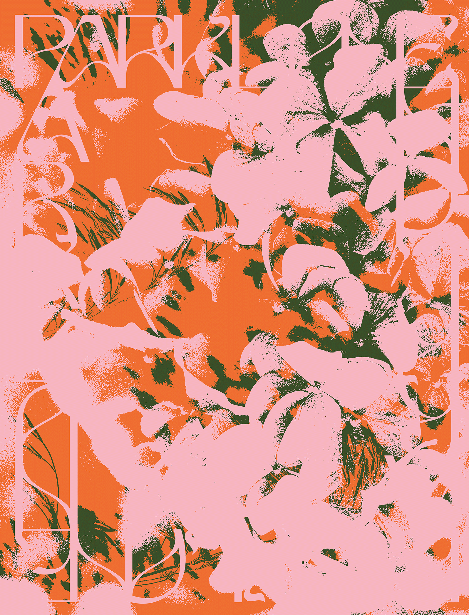
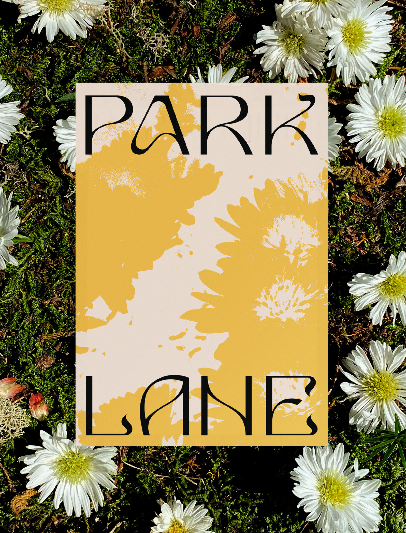
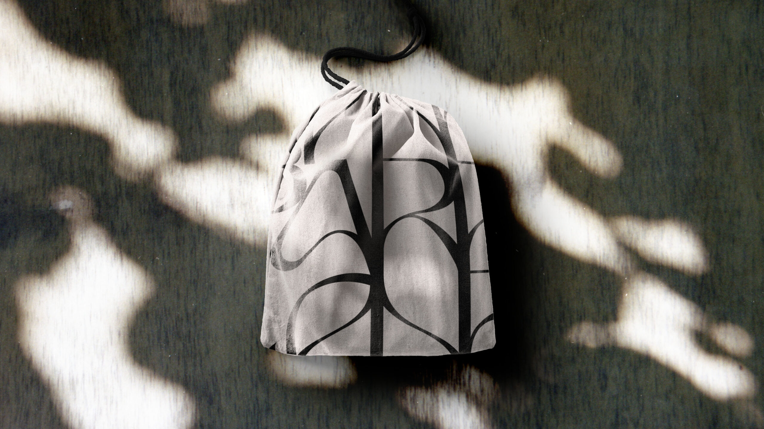
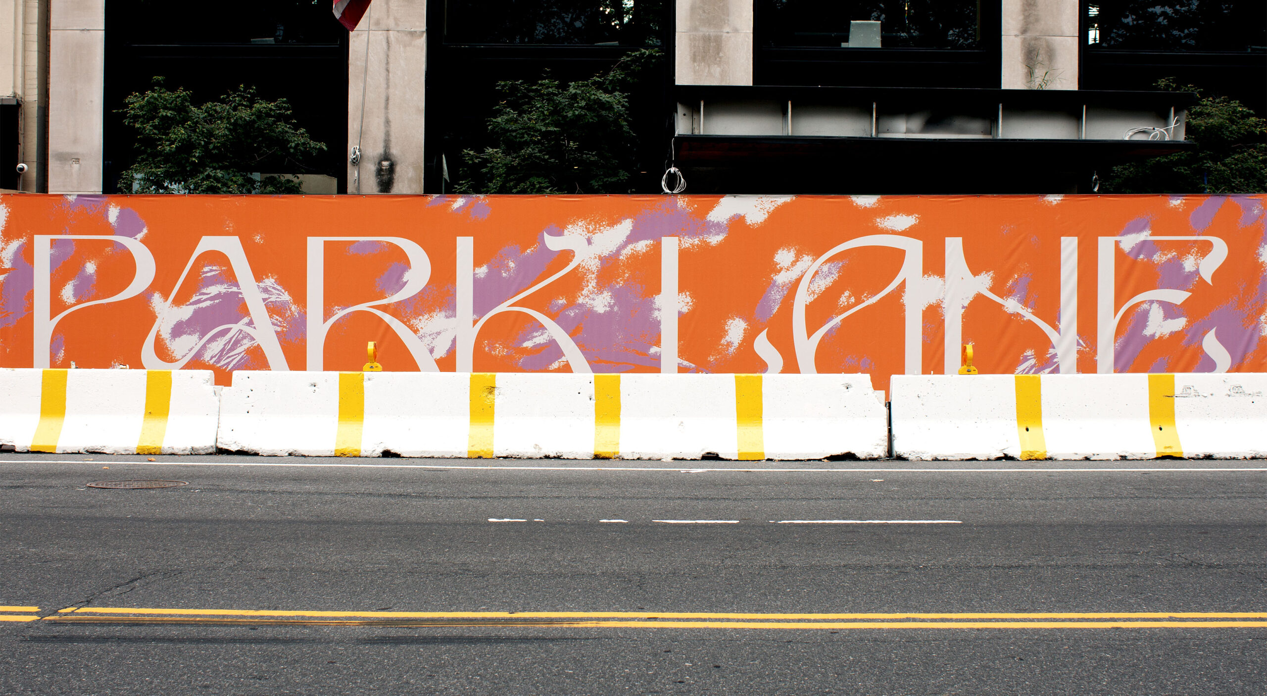
We drew inspiration for the brand story from the hotel’s new interior aesthetic and unique location along Central Park, using flamboyant colors and eclectic textures that invoke playfulness and accessibility. The new wordmark is inspired by both the architecture of the building and the nature within the park. Meandering lines, like wandering paths, taper off into whimsical, ornate flairs that resemble botanical tendrils. These organic elements are contrasted with contemporary, straight lines that harken back to the hotel’s iconic facade. Similarly, the “cartouche” shape of Park Lane’s windows informs the brand’s shape language; it serves to frame imagery, patterns, and text across the digital and physical spaces. The patterns we created are born from photographs of natural elements found within Central Park: rock faces, blades of grass, flora and fauna. We paired these textures with a color palette that rotates in accordance with the seasonal changes of the park, making the hotel feel like a living, breathing sanctuary and extension of the beauty that surrounds it.

Vanessa Hopkins 2022